by Sam Hutchinson,
edited by Debi Dalio (Blog here)
The way I paint depends a lot on the
subject and purpose. Designing a character requires a very different
approach to painting a still life. If I'm painting a character or
vehicle, I will always start with drawing because I find it gives
much more accurate and detailed results compared to starting with
paint. With concept art, it depends on which stage the subject is at.
If I'm sketching to explore ideas, I might work quickly with paint,
but if I'm designing something specific that will be modelled in 3D,
I'll almost always draw it first before rendering for the same reason
I do with characters or vehicles. When I'm painting an environment
for the fun of it, I'll often go straight to blocking out the scene
in color.
- Pressure-opacity – The more pressure you apply the
thicker the paint.
- Pressure-size-opacity – Same as above except the
brush starts small and increases in size with pressure.
Step 1 – Creating a Basic Plan

Step 2 – Using Perspective
Perspective and the horizon are extremely important to make the painting feel three dimensional. I've used a custom brush of a vanishing point to paint in the two vanishing points off screen. You can also use a 3D modelling program such as Blender to block in major elements and then just transfer the rough to GIMP via a screenshot.
Step 3 – Creating a Starting Background

Step 4 – Blocking in Major Elements
To block in the main parts of the painting, I work while zoomed out so I have a better view of how it all fits together. I've used a dark green color similar to the “water” in the background because I prefer to work from dark to light in most cases.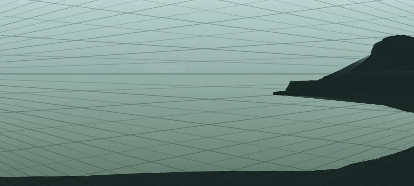
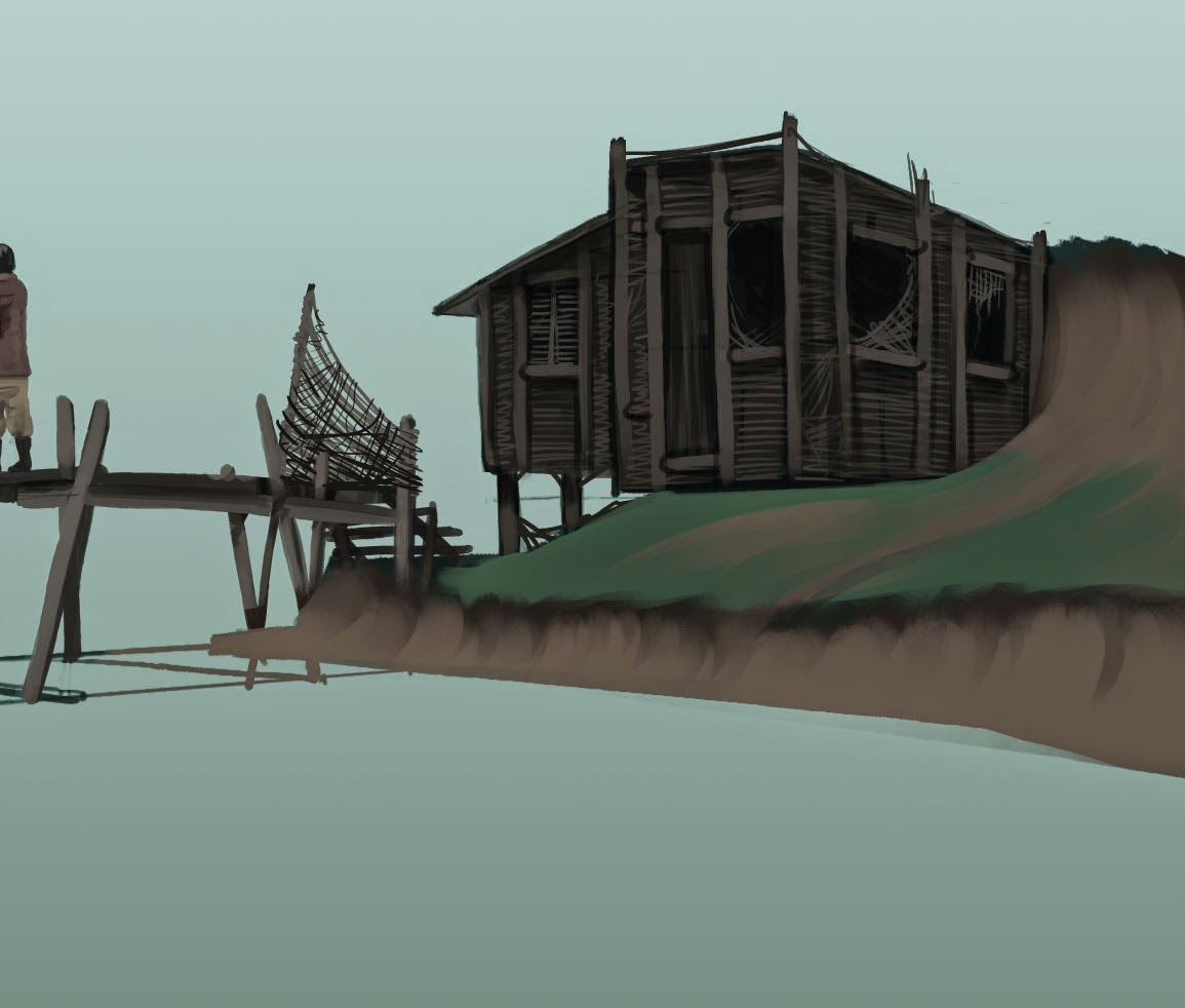
Now it's important to turn on the perspective layer created earlier in order to accurately draw the outline of the house. Incorrect perspective on a structure will look very confusing. I find drawing a box of the house shape is very useful here since the top edges aren't aligned to the perspective grid. I can then draw the roof line within the box.

The pier is much the same. I start with a box that will contain the pier and then add the supports.

Step 5 – Refining the Shack
Now that the actual painting begins, I like to upscale my image. I've doubled it to 5600x2520 pixels.Here I started with the base color of a dark brown using the “behind” mode so I could paint behind the line work. I made sure to get 100% paint with no sky showing through so there will be no strange colors appearing later on.

Next I moved on to a lighter color in order to paint in the beams. I've just used a pressure-opacity brush here and faded it out a bit near the top and bottom of the beams.

I painted in the walls while paying attention to the perspective. Here I have disabled the perspective layer because I could use the windows and the bottom edges of the house as references. This time I used a pressure-size-opacity brush so I could get detailed lines which become less visible as they reach the beams.

Now some shadows are needed on the hut. The atmosphere is overcast, so I focused on ambient light shadows and kept things soft. I've used a soft pressure-opacity brush here.
The image is too dark at the moment, but that is OK. I will fix that later on.
Step 6 – Painting the Pier
The process for painting the pier is almost the same as for the shack. The pier will be very poorly maintained though, so I'm going to make sure it looks like it's almost falling down. As always, pay close attention to the perspective. I left the perspective lines on the entire time I was painting the pier.It is not unusual to come up with new ideas midway through a painting and often these ideas can be easily incorporated into the current design. In this case I decided to narrow some of the walkway to be little more than a few planks. This is easy enough. I simply painted in some lines where the new supports would go but also kept the old ones in place so it would look like the pier had been damaged and repaired in the middle with limited resources.

I put a lot of variation into painting the walkway to make it look like it had been repaired many times, but never had much care. That is, it has lots of “patch-up” jobs.

While painting in the supports, I made sure their size, condition, and position makes sense in relation to the walkway.

Similar to the process of painting the shack, I added some lighter values to the walkway and then shadows where the parts meet. I used the paint mode “value” here. This allows you to quickly apply the shadows and light without worrying about painting beyond the established shapes, which can speed the process up.

I used a small pressure-size-opacity brush and painted in the details, such as the old net near the shack. I also deleted the sketch lines on top as they were no longer necessary. The ones down the bottom could still be useful though, so they will stay in for the time being.

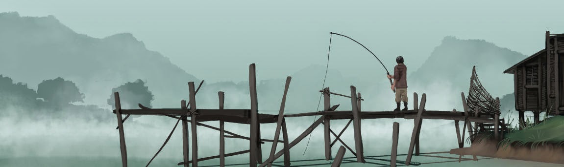
Step 7 – Painting the Fisherman
I created a new layer named “fisherman”. The first thing I did was to figure out how tall he should be. I did this fairly roughly, just projecting his size from the doorway of the shack out and then dropping the height down so it was resting on the walkway.
Drawing a basic stick figure skeleton is extremely helpful for getting a pose and correct proportions rather than starting by blocking out shapes with paint.

Because I had the skeleton drawn, it was easy to paint in the block color of the fisherman. I started with his jacket and boots and then painted his pants and arms. This made it easier to visualize the entire figure as opposed to painting the sections individually and losing track of things. I used a pressure-size-opacity brush.

After painting the basic figure, I added the lighting to it. You can use Alt+left-click on the layer to make a selection of the fisherman, then Ctrl+T to disable the marching ants and paint within.

Cloth folds are very complex and I often use a reference to ensure they look correct.
Because the fisherman is supposed to be behind the dock (we are looking from slightly below the pier and his fishing line is behind the pier) I moved his layer down.
Step 8 – Refining the Bank
Since the pier and shack are mostly done, I started to work along the shore.To prepare, I created a new layer called “temp”. The reason is that I'm now painting over the top of some elements I don't want to disturb for the time being, so this lets me erase parts to reveal the layers below and reduces pressure somewhat because if I happen to make a mistake I can easily erase it and not have to paint the areas again. I'll merge this layer down later on when I'm happy with it.
I've started with a dark brown for the base color of the dirt of the bank. This will be areas where the soil has eroded to reveal the dirt beneath and will have grass growing right up to the edge.

I painted over the grass areas so that it is well defined where the dirt begins and ends. The grass will be painted in more detail later, so I focused more on the position here. I also added a few brush strokes afterwards to make the transition a bit more interesting.

To lighten up the dirt sections, I used a large round pressure-opacity brush and dragged it in the shape of the hill to indicate the form. I also created some patches of dirt along the grass in the shape of the hill to not only further illustrate the form but also to add some variation. I made sure that I left a band of dark soil at the top (for shadow, because the grass will have a slight overhang) and blended it into the grass at the bottom of each section.
I also added some shadow to the curve of dirt that covers the rear corner of the house so that it blends together nicely. At the moment it looks like it floats above it.

To make the entire bank more interesting, I added some more variation in the form of some different greens and browns to the grass and dirt.

Most of the time, when painting in the grass, I color-picked at the base of where the grass was going so it didn't stand out too much. It's not about painting every blade of grass, but indicating that it's grass. By having contrast at the middle and end of the grass but not at the base it tricks your mind into seeing that color as lots of grass rather than green with some grass sticking out of it.

Painting the bank in the foreground is exactly the same process, but much faster since there is no grass there.
Step 9 – Painting the Water
Painting the water is very simple at this stage. I started with a new layer called “water” and painted horizontally with a pressure-opacity brush to make the water appear banded. I used a darker green color than what was there previously and made it darker closer to the front of the image. This is because the angle in which you view water has an effect on how reflective it is. The lower the angle the greater the reflectivity, so in the distance it will be almost sky-colored, but close up it's darker because you can see deeper.
Next I used a slightly lighter color to break up the bands a bit and added some variation to the value and color horizontally. I also used a large soft pressure-opacity brush to paint some of the dirt color onto the water so it would look more transparent.

Step 10 – Painting the Background
To paint the background, I enabled the perspective layer because it is important that the background is placed correctly; otherwise, it will look very strange. I made a selection from the base of the land upward so I could focus on the shape without worrying about the perspective or painting a straight bottom.
I painted the trees, which are going to be mostly obscured by fog, so I made them all a solid color. I find painting the outline of them first can be helpful.

I filled them and then used the eraser to cut away at the edges a little bit to make them look more random. I also added some “grass” to make the silhouette more interesting.

Finally I used a soft brush to erase the base so it would blend into the fog. I made sure there were no hard edges on the bottom.

I painted the mountains on a new layer with a rough pressure-opacity brush. As I mentioned at the start, the image is a bit unbalanced with just the pier and shack, so I have made the mountains on the far left much higher so that I can direct attention back into the center of the picture and help restore some balance.

I blended out the base of the mountains just like with the previous background elements. I used a soft brush here because the mountains exist to give context to the shack and swamp, but they shouldn't detract attention from the things in the center of the image.
I kept the contrast in mind when
deleting portions of the mountains and avoided creating focal points
where I didn't want them. For example, if I had erased a lot of the
mountain base on the left by the trees, it would have increased the
contrast and attracted attention, which would have unbalanced the
image. Because of this, I erased most of the mountain near where the
character is standing because I want him to be very visible.

For the fog I used a custom smoke brush
I had created previously, but you can use any brush as long as it is
random enough. I set the brush to pressure-opacity. This is purely a
background element at this stage. When finishing the image, I'll add
a foreground fog layer to plant the pier into the water and add
depth.
Step 11 – Cleaning Up and Including Minor Details
First of all, I merged the “temp” layer down onto the paint because I was happy with the changes at this point. I've mainly used the eraser to delete the perspective lines below the pier.
I also put in a waterline. I started by slightly blurring the area just along the waterline and finished by painting a thin bright line along the shore with a pressure-size-opacity brush.
 |
| Before blurring |
 |
| After blurring |
 |
| With waterline |
 |
| Before |
 |
| Extra details |
Step 12 – Creating the Lighting
Because the lighting is so subdued in this image, extra light can be added later on to give emphasis and balance out the image. In particular, I want to highlight the shack.I used the paint mode “dodge” and a soft brush and brushed over the areas I wanted to lighten. This brightened the image but kept the contrast. The darker the color you use with dodge, the greater the contrast will be, so I used a fairly dark grey. (Dodge will quickly ruin color if you use a color that is too saturated.) The Dodge tool is very useful, but also quite dangerous, and can create very ugly results if used too much or with the wrong colors.
I worked over the shack and character, always staying zoomed out and keeping the lighting in mind. The light is coming from all over the sky, but mainly from behind the character in the middle of the image, so I paid close attention to that while lightening up the various parts.
 |
| Before light |
 |
| After light |
Step 13 – Creating the Reflection
The reflection is easy enough to create for this image, despite how calm the water is. I started with the most difficult parts – the pier, the fisherman, and the shack. I merged the fisherman layer down, copied it, pressed undo, and pasted the copy onto a new layer called “reflection”. I flipped the image vertically and dragged it down until the base of the pier reflection was lined up with the actual pier where the pier begins at the bank.The next step involves roughly correcting the perspective in the reflection. Starting with the pier I made a selection of the part I wanted to fix.

I cut and pasted this and then sheared it so the bottoms were roughly lined up; then I anchored it.

I erased anything that was “above” the actual object. I suggest lowering the opacity to about 50% for this work because it makes it easier to tell what is reflection and what is is pier. I then manually cut, rotated, repositioned, and repainted the various parts until the perspective was more or less correct. The reflection looks a bit different here because we are seeing the underside much more in the reflection than above.

I used the Filters>Distort>IWarp tool to warp some parts of the reflection into a more realistic position. For example, I warped the base of the house in the very middle down and the outsides up.

I fixed the bank on the right of the image in the same manner that I fixed the pier. I also deleted the parts at the top of the image that aren't actually on the water.
I turned on the perspective grid again and painted the underside of the pier. I used the “behind” paint mode and did a fairly quick job blocking out what you would see in the reflection.


The reflection still isn't done yet. I set the layer mode to “overlay” and then took a dark color and the gradient brush with “FG to Transparent” selected as the gradient and dragged it out so the base of the reflection (closest to the source) is dark and the other half (the lower half) is untouched. I then took a large brush with a low spacing and used the Blur tool to warp the reflection back and forth horizontally.

I used a small pressure-size-opacity brush and erased some ripples from the reflection. This will help show that the water is actually water and prevent the reflection from being overpowering.

Step 14 – Creating Foreground Elements
Some foreground elements are needed to balance the image. There will be some grass on the right and some larger grass on the left. I'll curve it inward in a mirror of the fishing rod to help redirect attention back into the middle of the picture.I created a new layer called “foreground” and used a pressure-size-opacity brush to paint the blades of grass. I used a very dark green to distance the grass from the mid-ground.

I added another fog layer, which helps add some more atmosphere since right now everything is too sharp and prominent. Just like with the previous fog, I used a soft pressure-opacity brush. After I painted the fog, I Alt+left-clicked the “paint” layer that has the pier on it to make a quick selection and deleted some of the fog on the closest supports to make the entire pier a bit more three-dimensional.

Step 15 – Correcting Color and Minor Tweaks
At this stage it's down to finishing touches. First, I did a bit of color correction. I want the background to be more blue than the current greenish color, and also indicate where the light source is. Starting off on the very bottom layer, I used “Hue-Saturation” to make the sky more blue, then a large soft pressure-opacity brush and a very light blue to lighten the sky. Then I shifted the hue on the mountains to be slightly more blue as well.Another thing that stands out at this point is the mountains – they are too sharp and pull attention away from the character. For a 5600-pixel-wide image, I used a 12-pixel blur.

The image is almost ready to export, but first I want to make the entire thing slightly colder. I added a new layer called “colfix” and filled it with a strong cold blue, then set the layer mode to Color and turned the opacity down to 5%.

Step 16 – Finishing the Image
Depending on personal preference, you can flatten everything but the foreground and reflection and apply the blurs directly onto them, or do what I often prefer and create a new layer called “final”, disable the foreground/reflection layers, flatten the image, copy, undo, paste onto the final layer, and then enable the two layers again. I then duplicate the foreground/reflection layers and place them at the top. This way I have a copy of the image I'm about to export and can make changes if I want to, but everything I want to make more blue is on a single layer and easy to work with.The reflection layer will look strange, so it is necessary to delete the parts that are in front of the “paint” and “fog2” layers. To do this, simply Alt+left-click one layer and then Shift+Alt+left-click the second to make a combined selection, then make sure the reflection copy layer (the one for export) is active and press Delete.

Since I wanted to use focus blur on the Final layer, I had to create the mask first. I made a new layer, filled it with black, selected the Gradient tool with “FG to Transparent”, and dragged up a few gradients. I painted this with the layer disabled so I could see the background image.
 |
| The black and white layer behind the grass will be used for the focus blur/depth of field |
I used a soft brush and erased around the shoreline of the reflection layer so that it would match the focus of the shore.

Conclusion
I hope you are able to take away some useful info from this tutorial. Painting can be very intimidating at first, but I've always found that when you have a solid plan and break the job down into small steps, it becomes much easier and gives you a lot more confidence.Here is the final image at full resolution:
